Are we losing touch with the art of making in this age of advancing technology?

THE PALISADES, Aluminium, acrylic spray paint, plastic coated wire & wire, 82x40x18cm, 2017, Detail

Name: Polly du Cros

DOB: April 1969

Place of birth: Lancashire, United Kingdom

Occupation: Artist

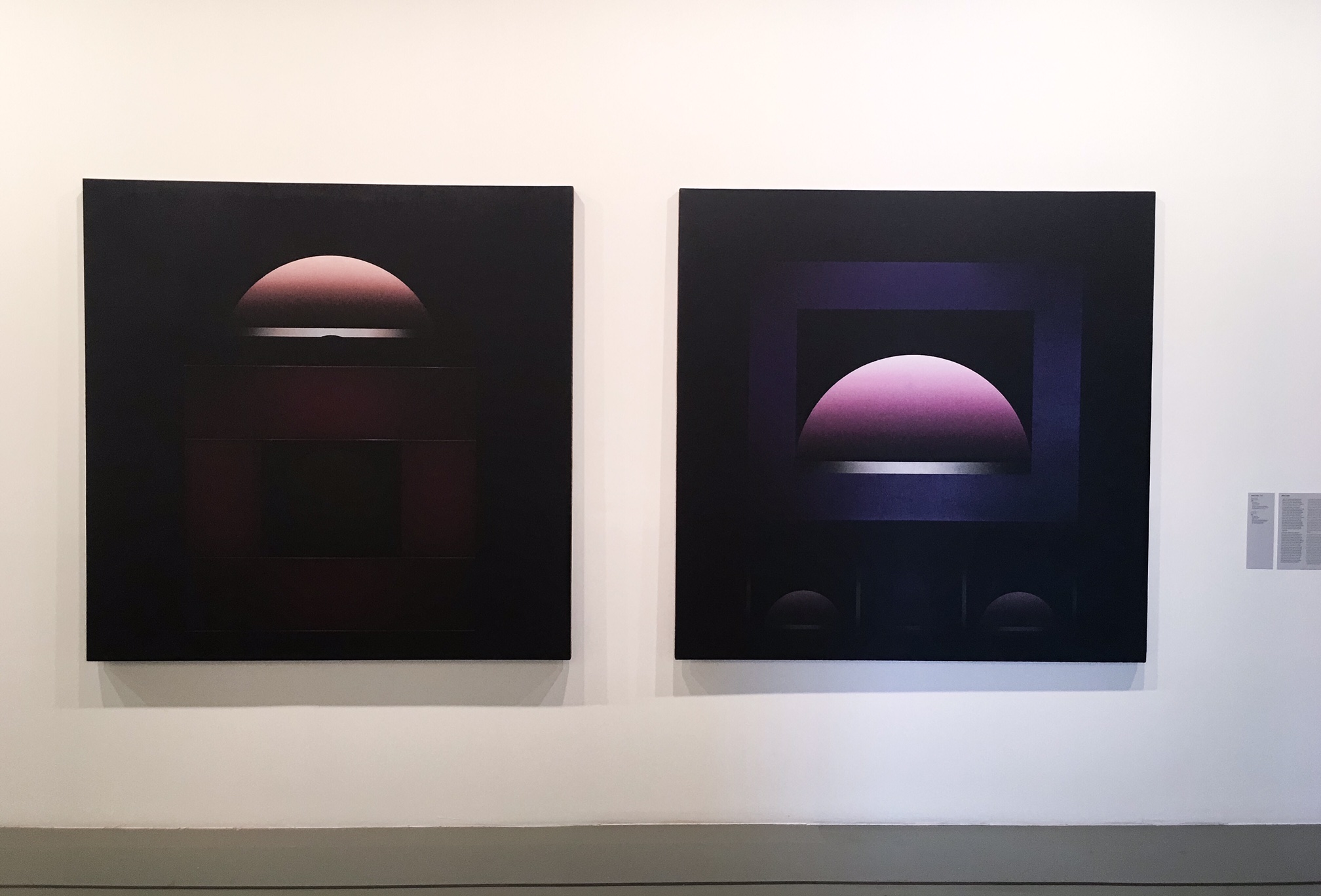
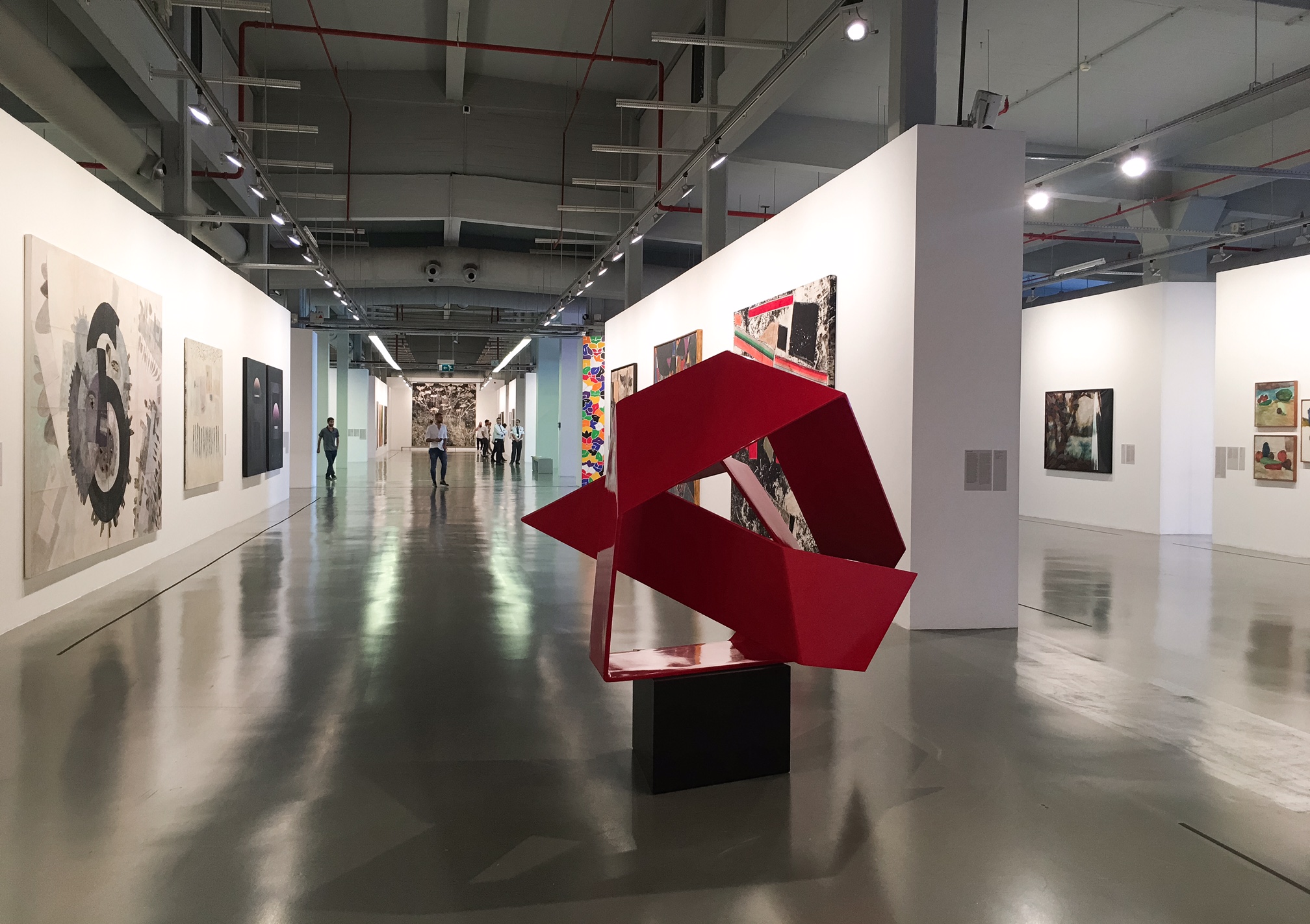
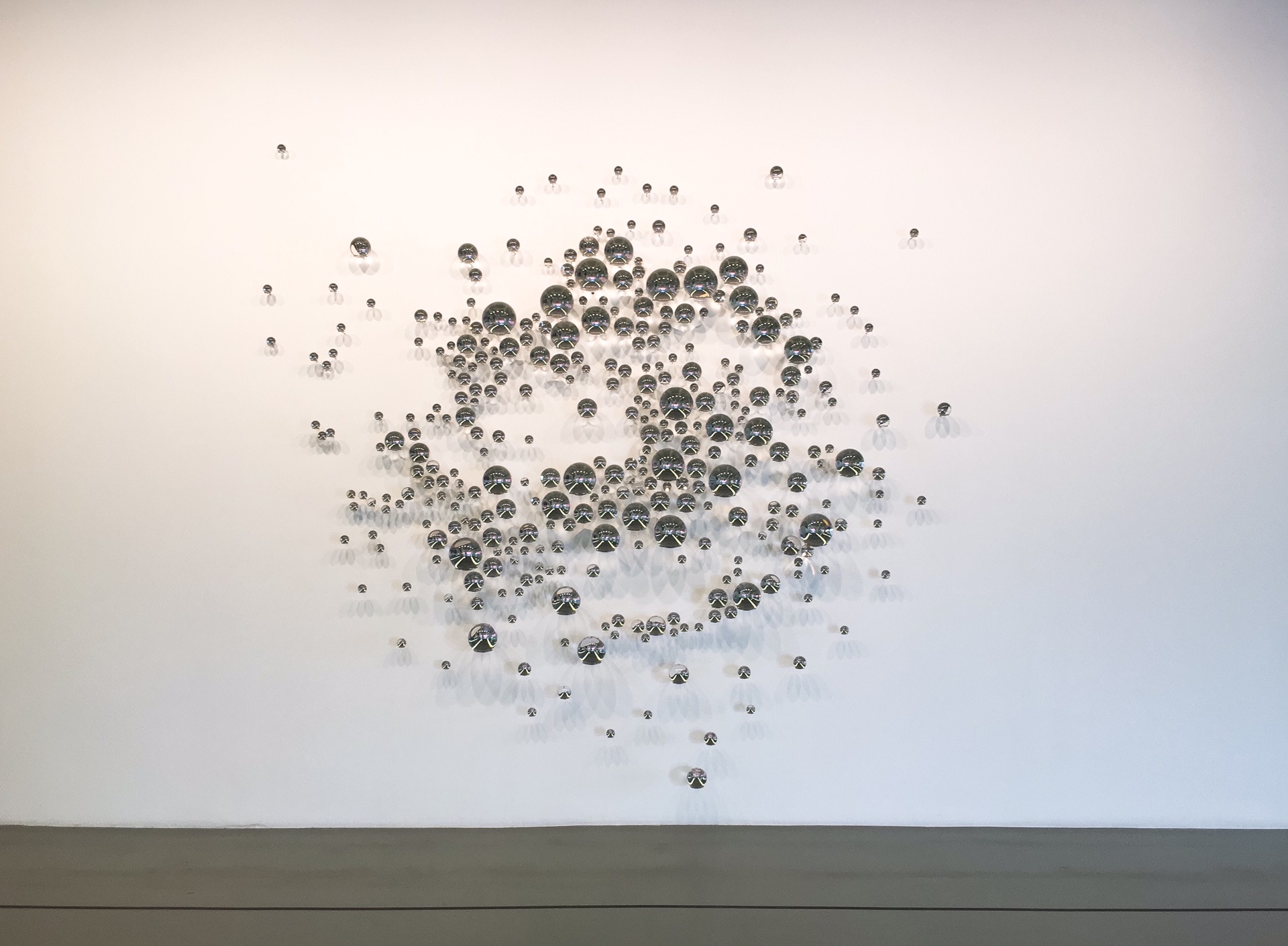
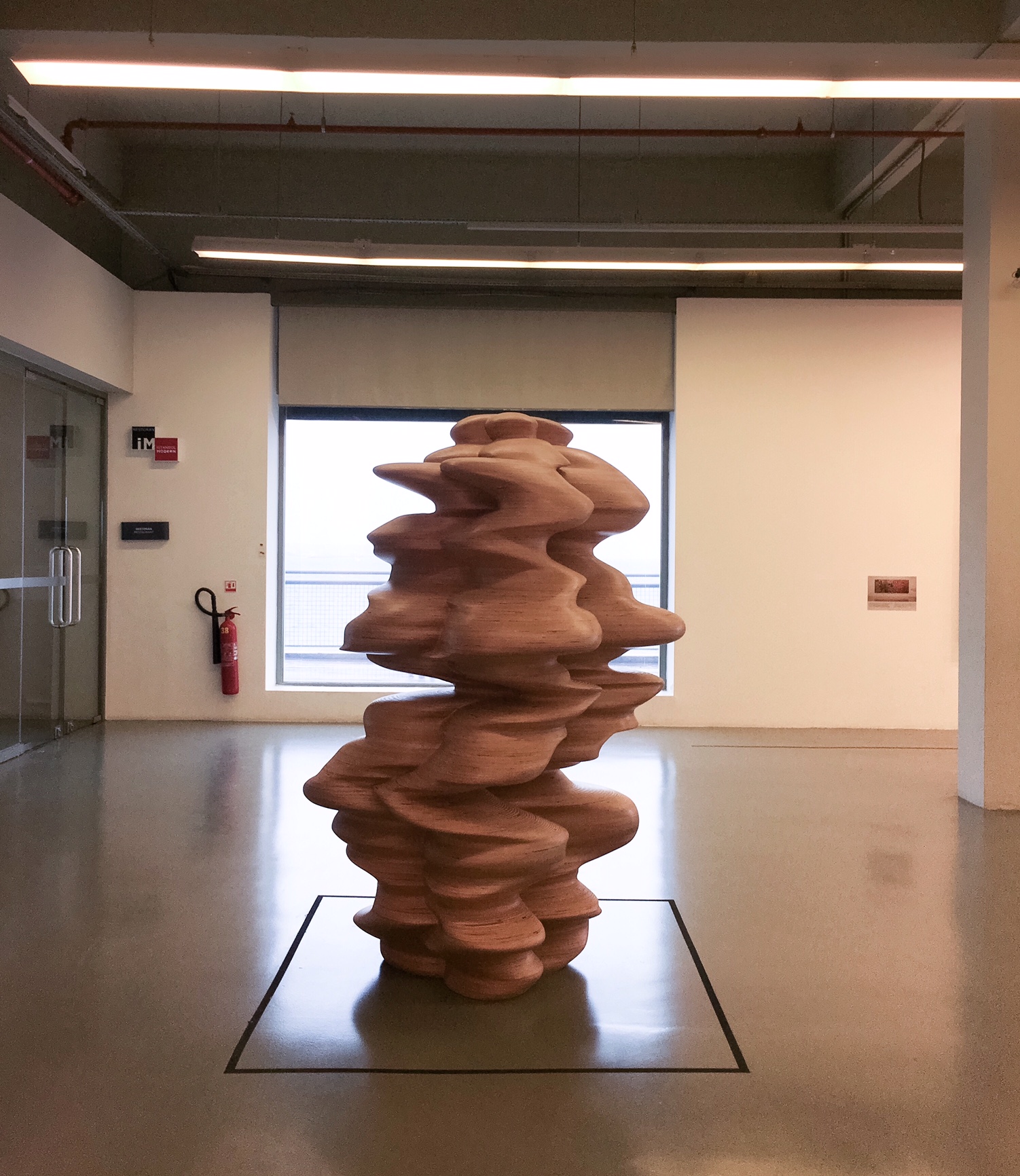
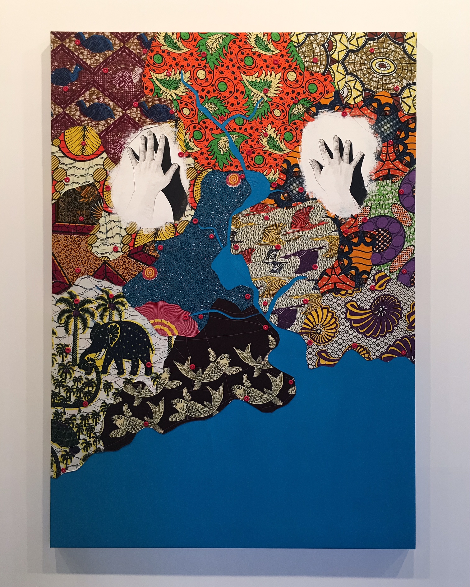
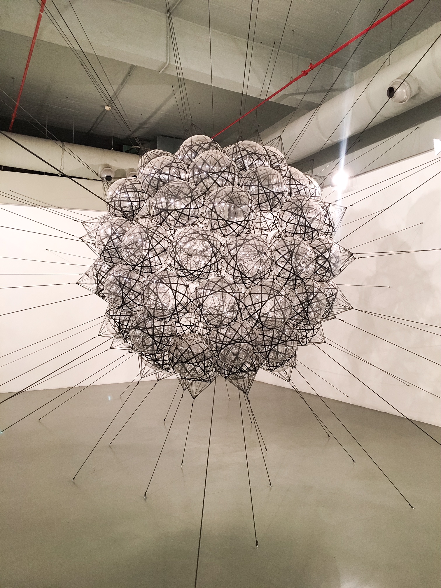
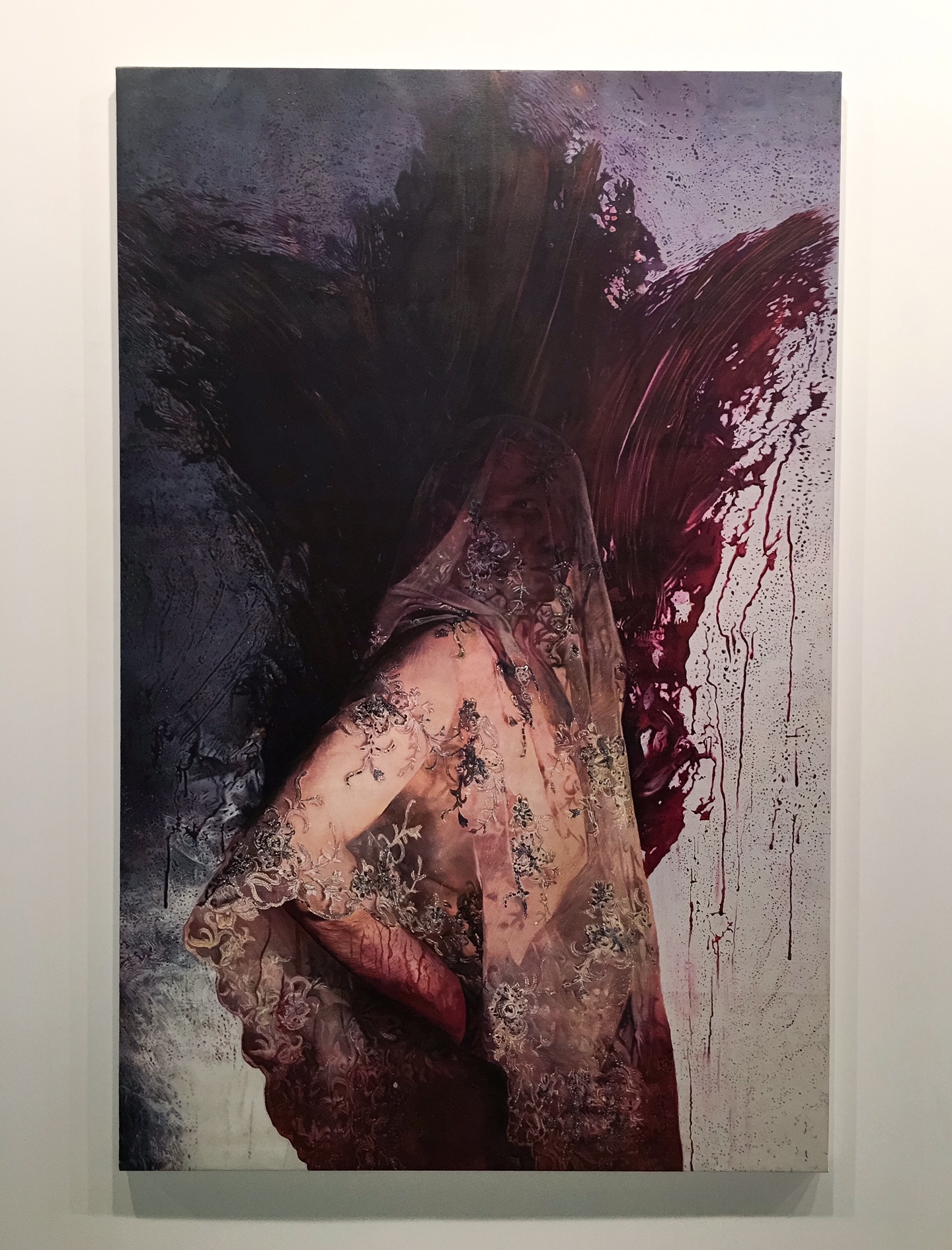
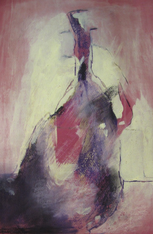
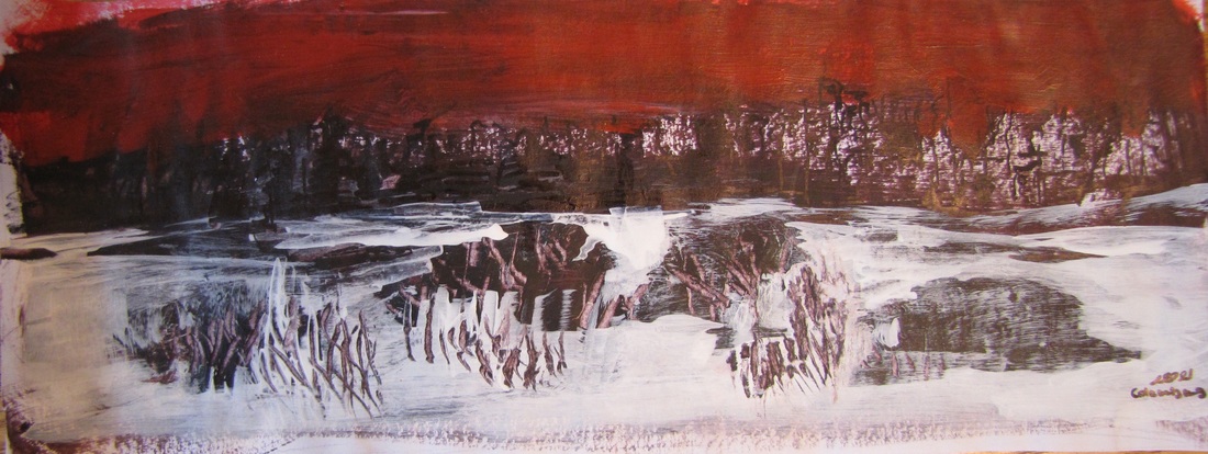
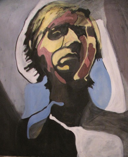
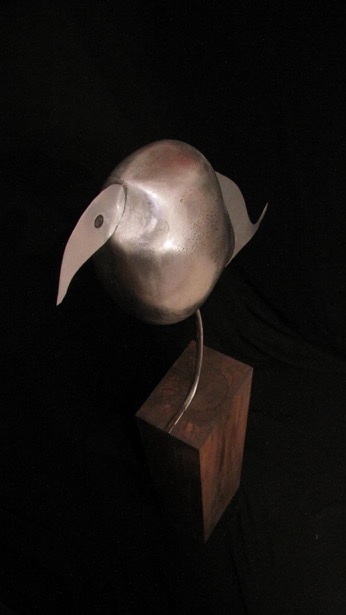
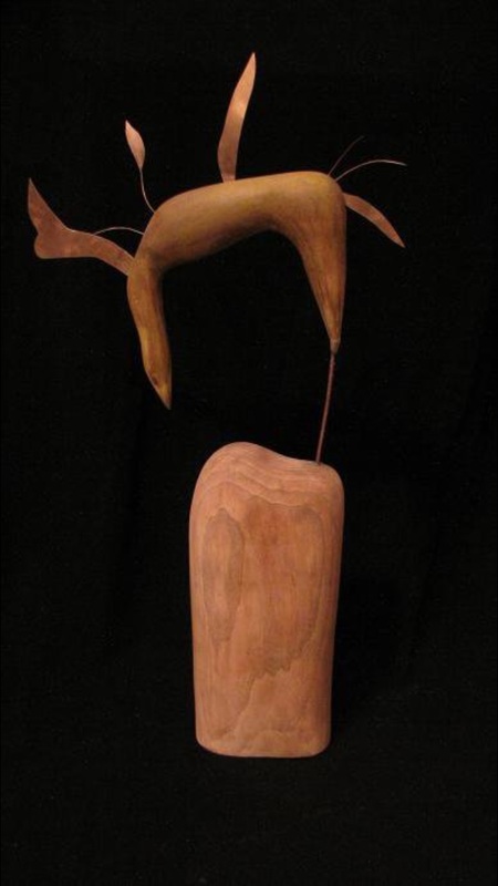
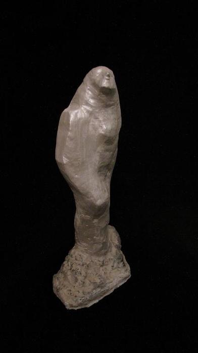
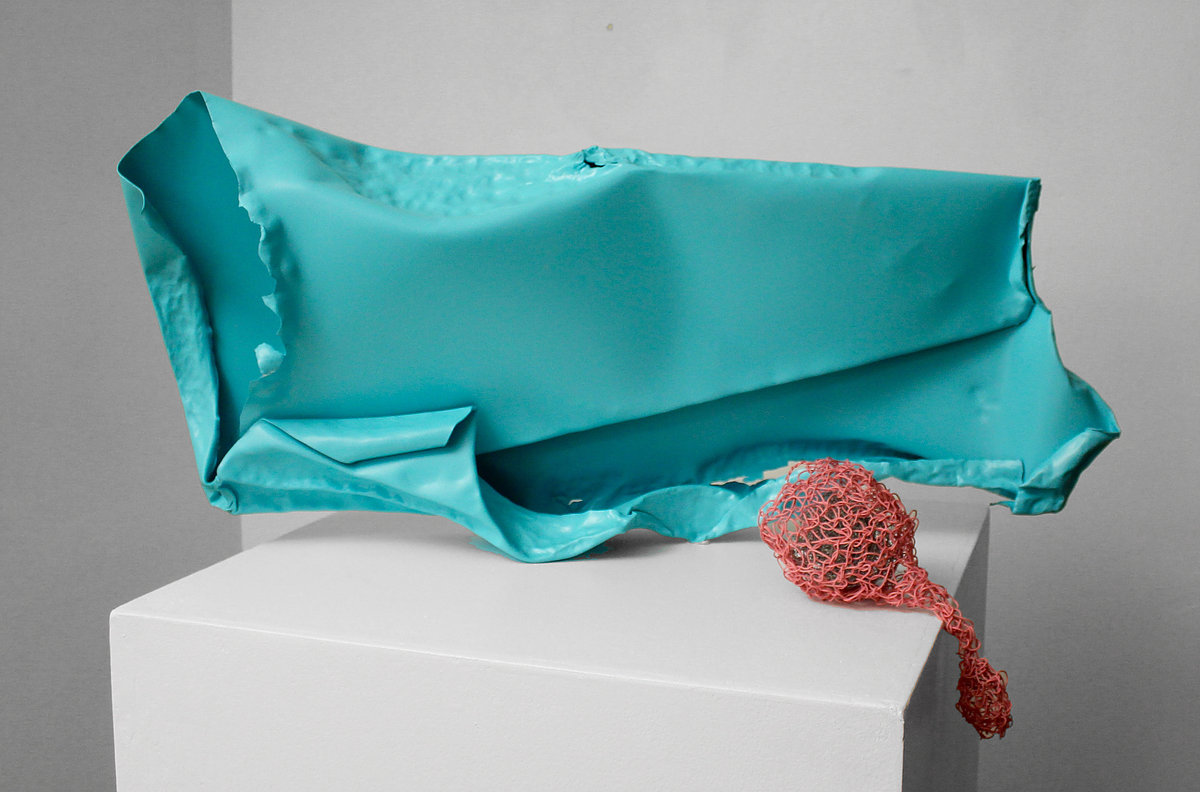
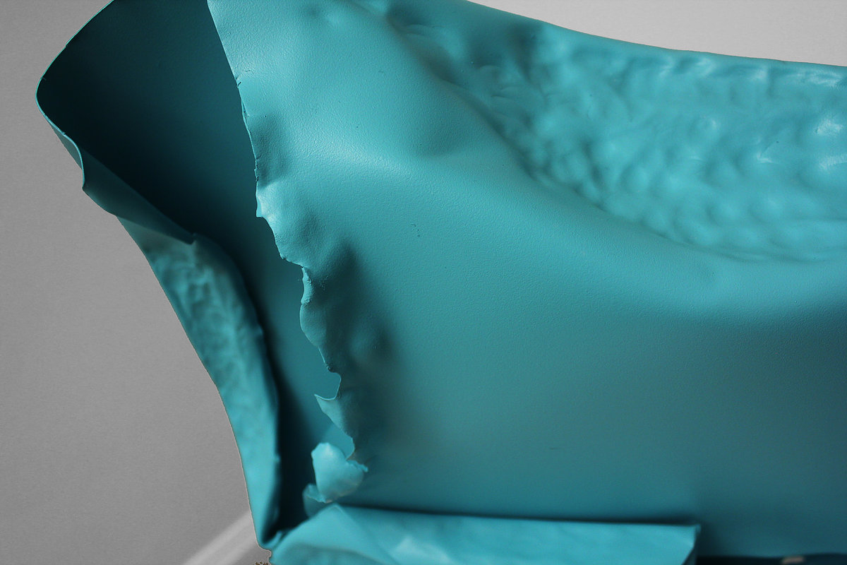
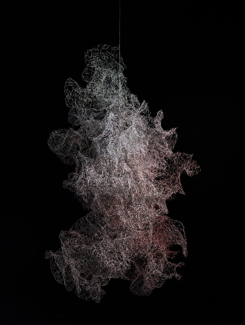
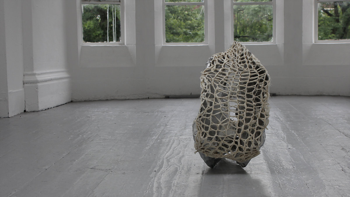
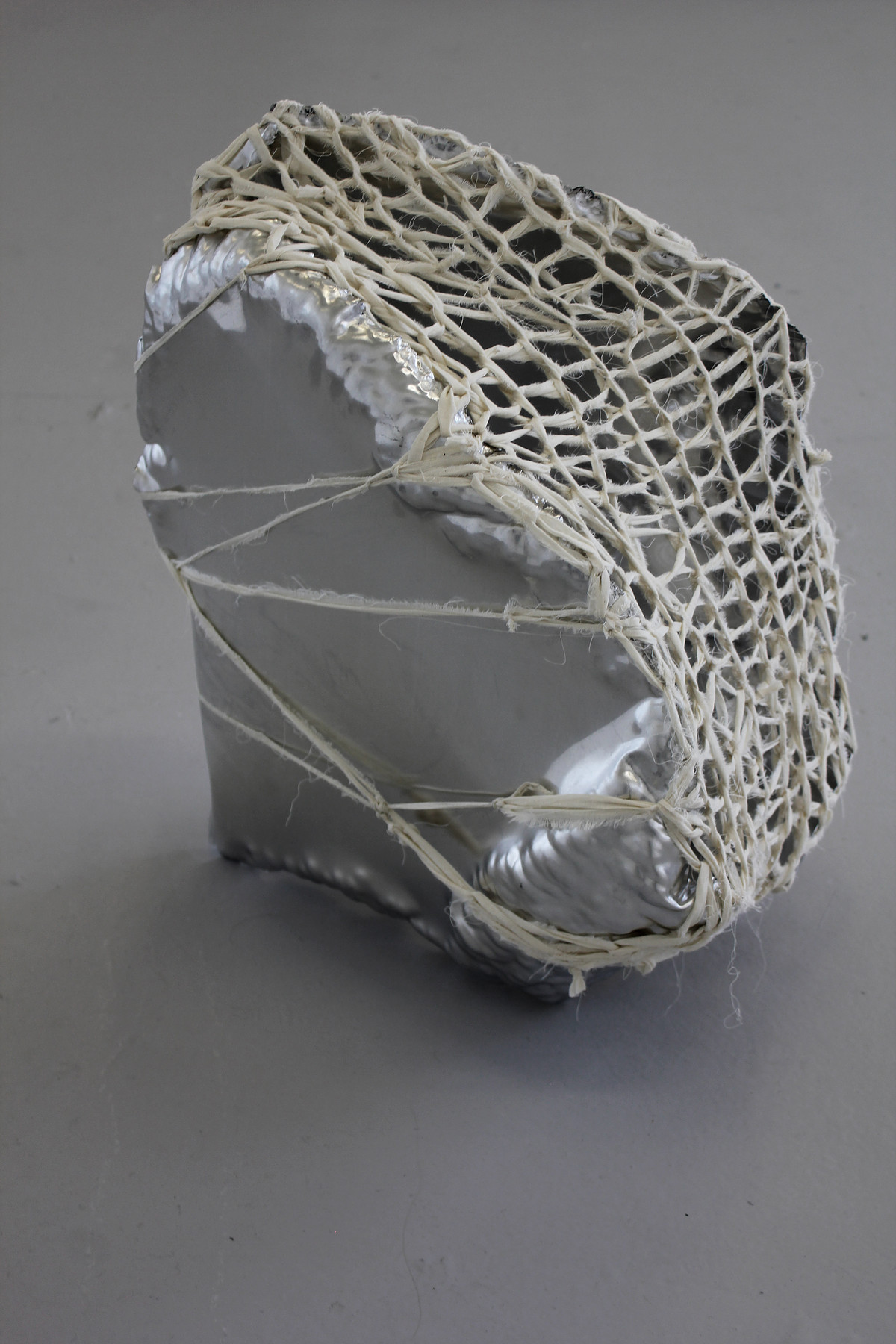
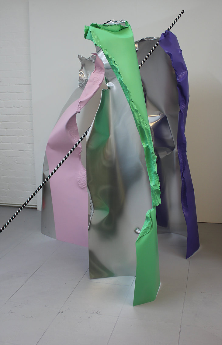
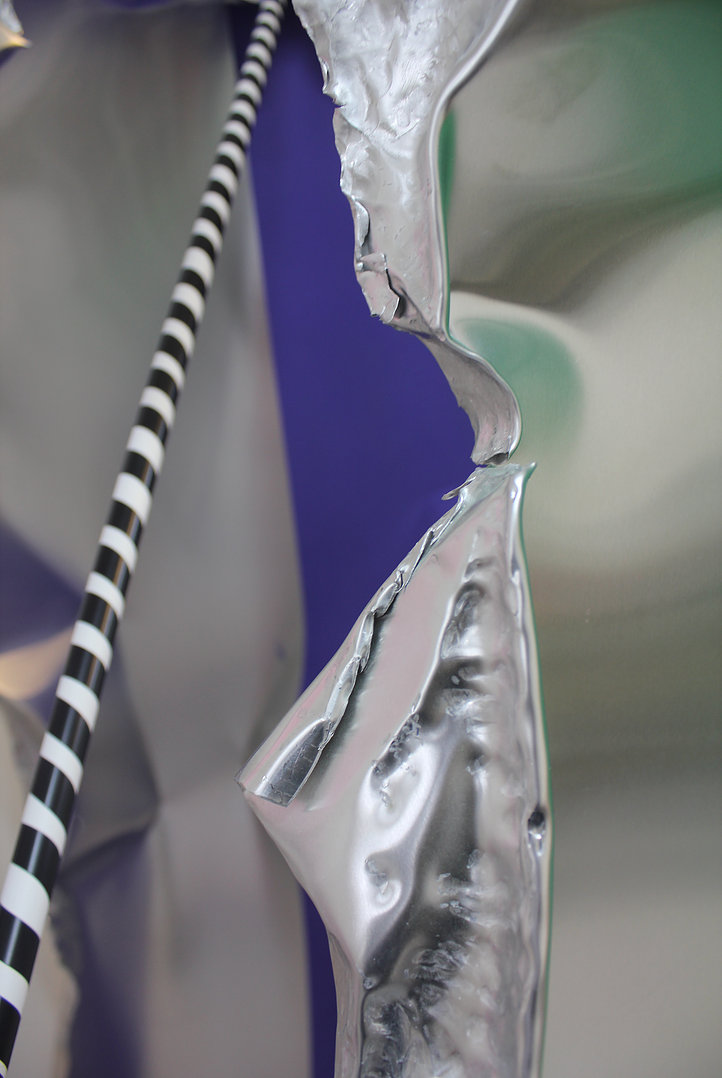
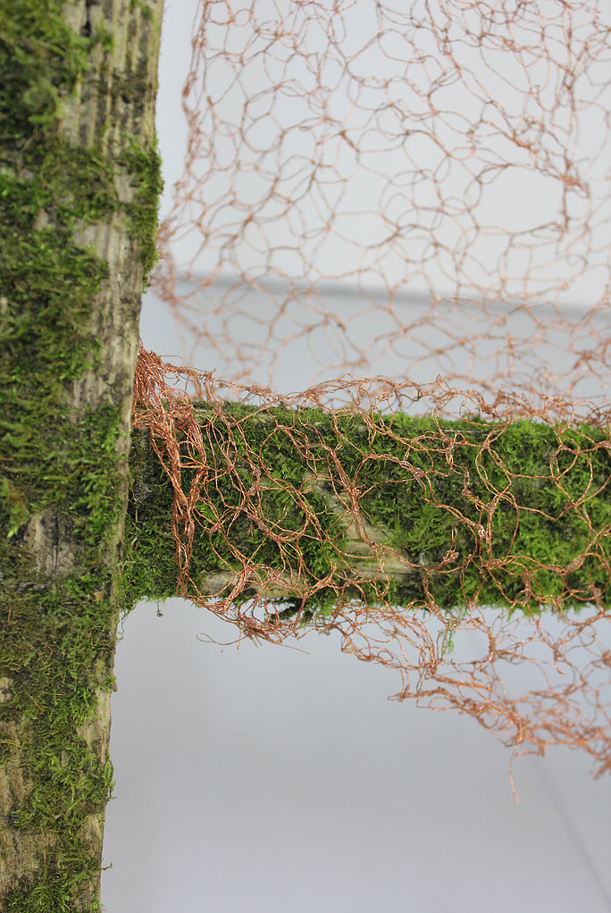
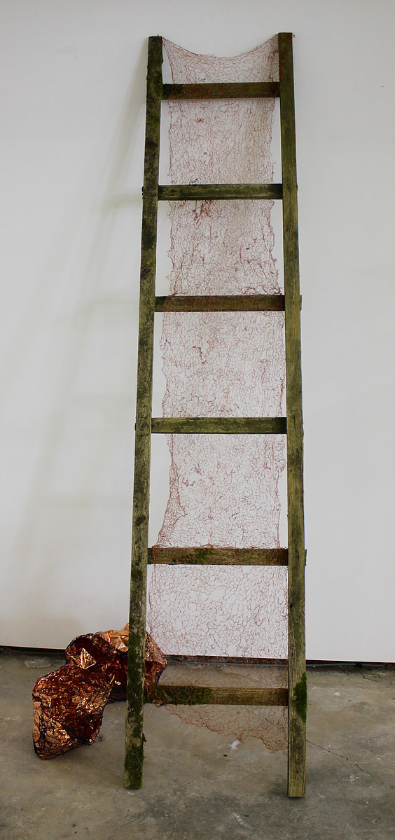
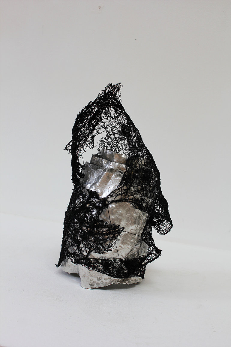
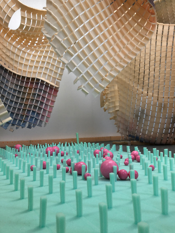
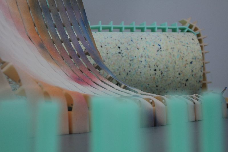
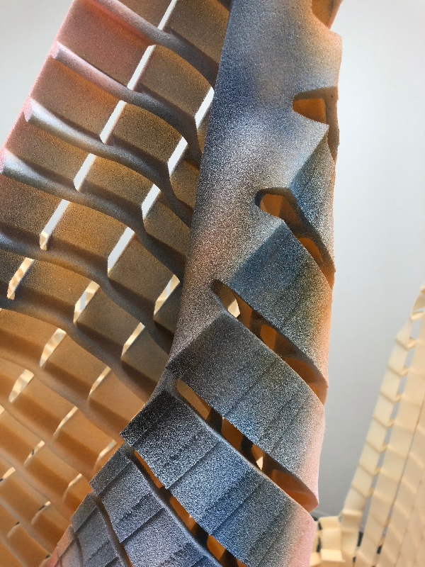
Polly works in sculpture/installation with an emphasis on making and materiality. Her spontaneous and instinctual process of being physically involved with the material means that the matter selected is exploited without controlling the experiment, to maintain an element of naivety. Current materials include metal, foam, polystyrene, plastic and scrap, along with paint. Working within the liminal space between the expanded field and sculpture works are developed within the space. She is interested in the way an object exists and is seen in a space and in the psychology of the response to it.

Wire, 2015
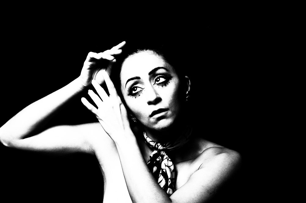
Photographer: Eva Lova

Polly’s rationale for being an artist is to ask are we losing touch with the art of making in this age of advancing technology.

Is it possible for me to make a body of work that questions the possibility of creating sculpture as a unifying experience which has as its cognate a parallel narrative in multiple digital sources or ‘feeds’. Is it possible for me to produce work that has a sense of unity.

FLOAT, Cotton thread, 5x4x2.4m, 2016

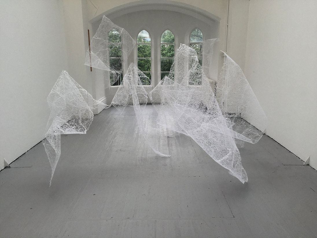
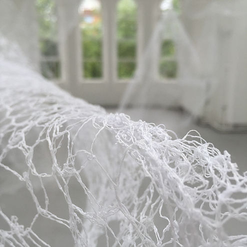
Underpinning my sculpture and installations are a fundamental search for something through action, grappling with materials and manipulating until a kind of truth or realisation is released during the process, allowing the intrinsic properties of the material to arise. The work avoids obvious connotations and is non-representational, it is, ‘about sculpture’. I enter into a mental dialogue with the material as to what is required and the process allows me to move beyond metaphor and into something more directly experienced. I am in a place of ‘flow’ and completely absorbed in the making of the work.

GUARD, Aluminium, 150x50x95cm, 2016

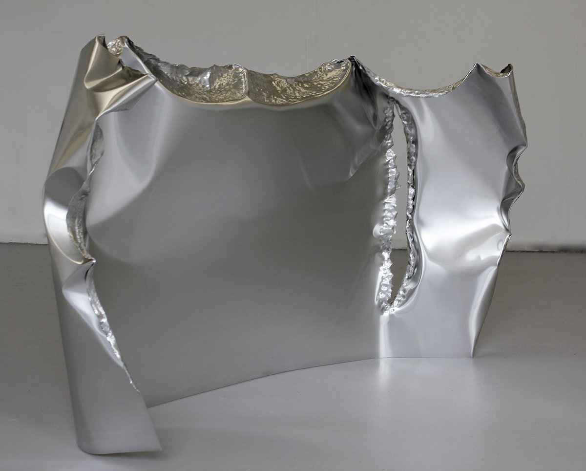
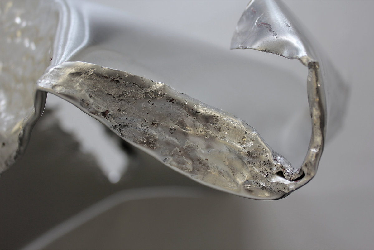
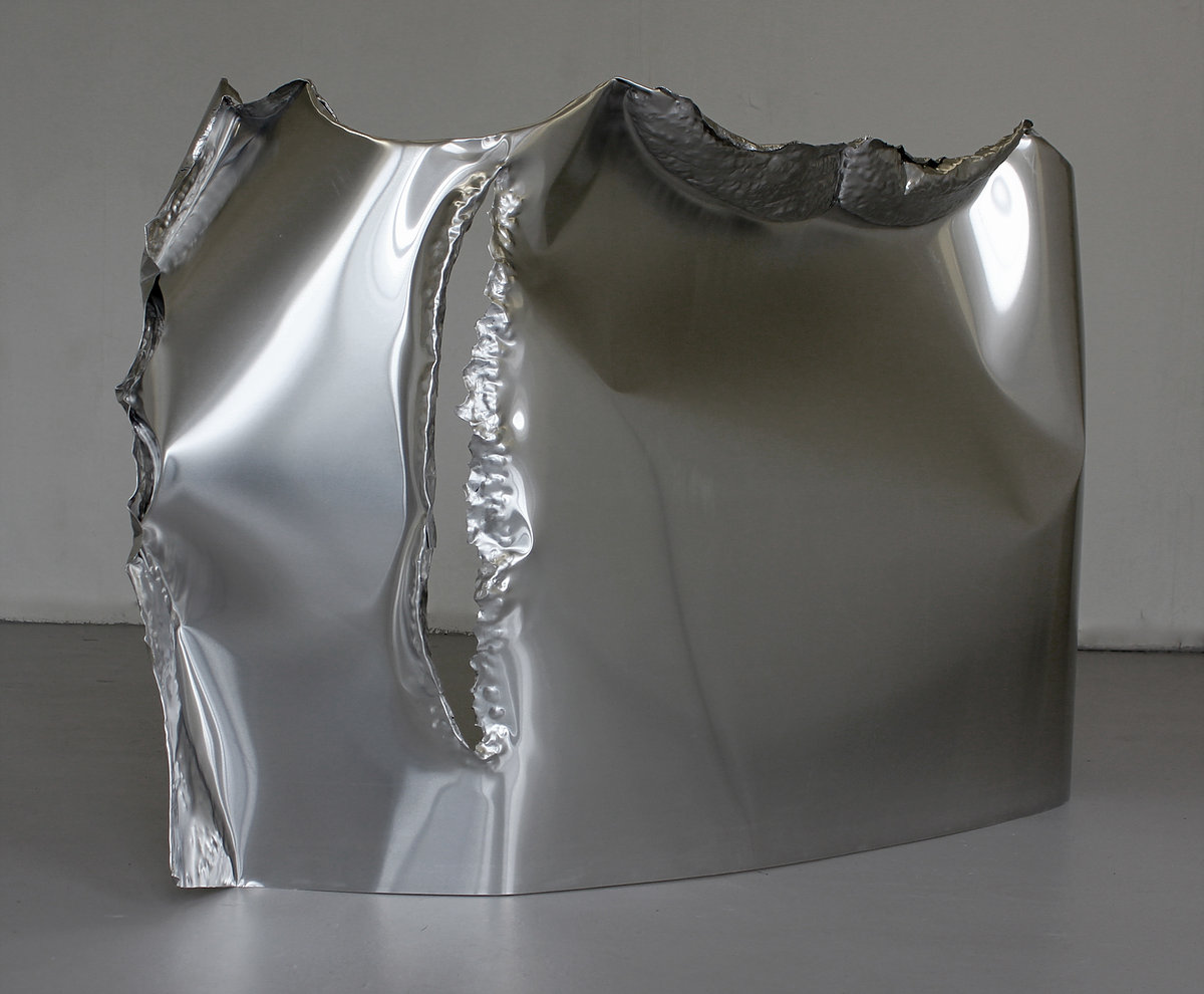
Influenced by the human body and how it leaves a memory of its action on the material, the work is physical and confrontational. I both isolate and absorb myself in the making process to allow the materials to dictate their form. I am keen to find out about the materials and what they need on one hand, whilst controlling them on the other; this balance is central and sought.

In my day-to-day studio practice I have perceived an unexpected correlate for this period of total ‘flow’ with the data streams of information I receive.

TWILL HOOKED, Aluminium & calico, 40x30x50cm, 2016

The frenetic lives we lead are in part due to the digital communication that takes place. We are constantly bombarded with information via technology and many different components are acting upon us at any one time. How does this translate within the work that is being made and can we separate ourselves from these influences or does every piece of information become stored on a cellular level in our bodies and therefore affect the work in progress.

TRIDENT PROP, Aluminium, acrylic spray paint, plastic tubing and tape, 220x160x180cm, 2017

Walter Benjamin’s essay, The Work of Art in The Age of Mechanical Reproduction continues to play a role in understanding how technology contributes to a de-aestheticization of art in the modern world.

Artist Helen Marten creates work that is multi-faceted and currently we seem unable to establish if there is a master narrative or unity to her work. I intend to contribute to the debate by making sculpture and questioning if unity is possible or if technology is responsible for the disparate nature.

TRACERY RUNGS, Wood, moss and copper thread, 246x50x75cm, 2017

I am concerned with the expansion of taste. Taste in terms of what can be accepted in the making process, and what cannot. Within these concerns is an awareness of the potential space for creativity, the heightened idea of potentiality through the process of making. When is the mark or the action encouraged, nurtured and honed, and when is it eradicated or altered? Such a potential space is paramount in the work and occupies a place where language and communication occur.

APOGEE, Aluminium & cotton thread, 27x23x30cm, 2016

I graduated from St. Helens College (part of Chester University) in 2011 where I achieved a first class honours degree in Fine Art (Painting). In 2014 I undertook an MFA in Fine Art at Manchester Metropolitan University which was successfully completed in October 2016.

Methods:

The central objective is to continue to make a work within a practice-based methodology. As such original investigation will be undertaken to gain new knowledge, partly by means of practice and partly by the outcomes of that practice. The objectives and methodologies are therefore intrinsically linked as the practice is evolutionary.

References:

W. Benjamin, 1936, The Work of Art in the Age of Mechanical Reproduction; Broderson XV

Berger, John, 2008, Ways of Seeing, Penguin Modern Classics

Cooke, Lynne, 2011, Agnes Martin, Dia Art Foundation, New York

Elkins, James, 1996, The Object Stares Back, Harvest, Inc. New York

Csikszentmihalyi, M, 1996, Creativity, New York, Harper Collins

Exhibitions

COMPETITIONS, AWARDS

2017,  3D Prize, West Lancs Open, UK

2015,  Blooom Award by Warsteiner , shortlisted

Residencies

2018, Abingdon Studios, Blackpool, UK

2017, The Great Medical Disaster, Manchester, UK

TWO MAN SHOWS

2018 with Paul Bramley, The Abingdon Experiment, Abingdon Studios, Blackpool, UK

2017 with Paul Bramley, Recent Works, Studio 24, Leeds, UK

2017 Jenny Eden & Polly Tomlinson, Cornerstone Gallery, Liverpool Hope University, UK

Group Shows

2017 Transfuse, The Great Medical Disaster, Manchester, UK

2017 West Lancs Open, Chapel Gallery, Ormskirk, UK

2016 MFA Show Grosvenor Gallery, Manchester School of Art, UK

2015 MA Show Grosvenor Gallery, Manchester School of Art, UK

2015 Electric Open Electric Picture House, Congleton, UK

2014, West Lancashire Open Exhibition, Chapel Gallery, Ormskirk, UK

2014 Degree Show St. Helens College, UK

2013 8BA2 Show St. Marys Market, St. Helens, UK

2013 St. Helen’s Open, World of Glass, St. Helens, UK


©Polly du Cros

Kaveh Golestan: Prostitute Series, 1975–7

Untitled, Prostitute Series, 168 x 248 mm

Kaveh Golestan was born in 1950, Tehran, Iran. He was a photojournalist and an artist who worked in both Iran and Britain.

Untitled, Prostitute Series, 247 x 167 mm

Kaveh Golestan’s socially engaged photography exposes the plight of people living on the margins of society.

Untitled, Prostitute Series, 247 x 167 mm

This series of portraits, taken between 1975 and 1977, documents sex workers from the former red light district, Shahr-e No, in Tehran, Iran. Following the 1953 Iranian coup a wall was erected around the area, creating an inner-city ghetto where approximately 1,500 women lived and worked. Here Golestan witnessed ‘the social, financial, hygienic, behavioural and psychological problems that exist in everyday society… magnified.’

Untitled, Prostitute Series, 167 x 247 mm
Untitled, Prostitute Series, 248 x 167 mm

Golestan spent several years researching the area and gaining the trust of the residents, developing a connection with his subjects evidenced by the sensitivity of his portraits. Golestan believed in the power of art to challenge accepted narratives. By documenting harsh realities with brutal honesty he hoped to raise awareness of the issues facing society and encourage the public to take action.

Untitled, Prostitute Series, 248 x 167 mm
Untitled, Prostitute Series, 167 x 248 mm
Untitled, Prostitute Series, 248 x 167 mm

Golestan commented, ‘I want to show you images that will be like a slap in your face to shatter your security. You can look away, turn off, hide your identity … but you cannot stop the truth. No one can.’

Untitled, Prostitute Series, 245 x 157 mm
Untitled, Prostitute Series, 247 x 167 mm
Untitled, Prostitute Series, 167 x 247 mm

During the Iranian revolution of 1979 Shahr-e No was deliberately set alight. The authorities made no attempt to put out the fire and there are no records of how many women died.

Untitled, Prostitute Series, 248 x 167 mm

Under the newly formed Islamic Republic, the area was demolished in an act of ‘cultural cleansing’ and today bears no reference to its past. Golestan’s images are among the last known records of the women of Shahr-e No.

Untitled, Prostitute Series, 247 x 167 mm
Untitled, Prostitute Series, 248 x 167 mm


You can now visit this exhibition at Tate Modern.


Photo Credit: Kaveh Golestan Estate

Biography: Art Road

Notes: Tate Modern

Part of what I saw and lived as a child is reflected today in my work

“No.1 / series: The Artist’s Mind” – Mixed, Acrylic and recycled cardboard on wood- 18.5in x 18.5in x 1.57in, 2017

Name: Leo Vergel

DOB: December 1988

Place of birth: Cartagena de Indias, Colombia

Occupation: Artist

I was born on December 16, 1988 in the Caribbean city of Cartagena de Indias, Colombia, I was given the name Jesús Leonardo Vergel Alvarez, but I prefer Leonardo Vergel, because of the pressures of this society that is always dictating what to do, ending up giving up and studying a university degree “Profitable”, which by the way does not end because I decided to make art and live from it. I have never entered an artistic institution, I firmly believe in confronting the work a thousand times and do it very often, I am totally self-taught, painting now means for me to have recast the child I had forgotten.

“Palenquera No.1” – Mixed, Acrylic and recycled cardboard on wood -38.19in x 27.36in x 1.57in, 2015

“Palenquera No.2” – Mixed, acrylic and recycled cardboard on wood- 24.02in x 17.32in x 1.57in, 2016

My technique is to use colored cardboard cutouts, I can use them in a way that has an order or a random shape purposely that allows me to express the idea at that time. The shapes I use are rectangular, square, rhomboid or other triangular cases, I think it is because when I had a little fun playing using these materials and associated them with those geometric figures I saw in school.

“Palenquera No.3” – Mixed, Acrylic and recycled cardboard on wood- 48.03in x 36.02in x 1.57in, 2017

This can also be seen in the funds that I make in my works, to this is added that when I was 7 or 8 years I saw a lot of Japanese TV program called “nopo y gonta” where the presenter very creatively taught Children on topics such as geometry and how this could be creatively used to create any number of fun objects. Part of what I saw and lived as a child is reflected today in my work.

“Mango”- Mixed, Acrylic and recycled cardboard on wood, 55cm x 44cm x 4cm, 2016

My work is handled in a genre that I still try to understand and that for me is handled between painting and collage, but I could not say that it is clearly one or the other. My work begins to manage a little symbolism, from the memories, what I live in my daily life and what I think or how I see the world.

“No.2 / The Artist’s Mind” Acrylic and recycled cardboard on wood, 2017
“No.3 / The Artist’s Mind”- Mixed, Acrylic and recycled cardboard on wood-31.89in x 28.74in x 1.57in, 2017

I like to think that it is Fauvism, by the way I express myself emotionally through color, but with recycled cardboard of vivid colors reinforced with acrylic. I have seen and I am inspired by works of great masters like Gustav Klimt, the way as in his work and uses the color are great teaching for me and I try to achieve it with my work, that the color and the human figure achieve a moving impact In people to the point of reflection. I would like very much to get my work to transcend my generation and in fact to impact people, to let people know that there are always second chances, I want to leave a legacy. My technique is inherent in me, it represents my childhood, when you do not have the resources to paint the only thing that matters is you and your imagination, the rest you forget, it loses importance.

“Open Cage”- Acrylic & recycled cardboard on wood, 45.67in x 35.83in x 1.57in, 2017


Exhibitions

2015- Artists Happy Hour. Roxana Avila. Badillo Hotel Gallery. Cartagena Colombia.

2016- Project 30. Art Director: Leonardo González. XIX Festival Zaquesazipa-Funza.

2016- Funza, Cundinamarca, Colombia.


© Leonardo Vergel

Istanbul Modern

Artists In Their Time

Istanbul Modern’s collection exhibition, “Artists In Their Time”, focuses on how artists position their work and themselves within the concept of time. It suggests a conceptual field for examining, and reconciling, the links between an artist’s time and societal, cultural, natural and universal time. It unites artists from very different periods, geographies and disciplines around common themes.

“Artists In Their Time” highlights how artists experience their own times, feel anxious and frustrated that time emerges from the past and flows into the future, and form bonds between their own internal time and that of others. The exhibition also presents a base for discussing the place of art in transience and change and the transformation of art. Through which times does a work of art pass to become part of the present, of the moment we are now observing? What is the meaning of the temporal relationship that works of art establish with one another? What conditions do works of art resist, or what conditions are they absorbed into, in order to maintain their relevance in the future?

Art Road Visiting Istanbul Modern
BAD 2014 – High density foam, wood, mirror and painted glass

Doug Aitken

‘In Aitken’s works composed of graphic texts, we notice words such as Now, End, Speed, You, One, Bad, Space and Home. Through these works, Aitken crystallizes the meaning of words that are repeated or or questioned in modern life. In some of these works, the surfaces are mirrors, in others they are covered with diverse images, such as the sea, leaves, planets, or black and white photographs. The artist freezes an idea or word in fluid time and makes it still.

As is the case in “BAD”, works having a mirrored surface give viewers the sensation of peering through a kaleidoscope. When we look through a kaleidoscope, the reflection of light forms colorful patterns. When we rotate a kaleidoscope, the image we see constantly changes and non-repeating images appear. In this work, too, the light of one moment is never the same as that of another moment. The time of the work and the conditions of the space within which it is displayed constantly change. Aitken thus addresses the difficulty of holding on to an idea or image in today’s dynamic and rapidly transforming world.’


Abstract (Temporality…Water…Sun) 1953 – Oil on canvas

Fahrelnissa Zeid

‘Her artistic practice can be classified under the following periods: Her early period of figurative compositions with spaces constructed according to the style of miniatures; her period of maturity with geometric and freely abstractionist works reminiscent of stained glass surfaces; and her late period consisting mainly of portraits and in which psychological narrative comes to the fore.

“Abstract (Temporality… Water…Sun)”, from the artist’s period of maturity, was produced during the École de Paris period that emerged in Paris following World War ll and was dominated by non-figurative abstract art. The painting combines colors and movements that emphasize the chaos and dynamism of the earth, the universe, and humane nature.’


Sculpture With a Monkey Skull Dancing in front of Sarkis’ Big Times-1989-2009
The first and only Turkish version colored neons and a sculpture from the Congo

Sarkis

‘The words in the neon work featured in his solo exhibition “Site”, which opened at Istanbul Modern in September 2009, indicate the different stages of his career. Sarkis comments on this work: “The stages of my career in art were written in neon like the names of night club singers. An African sculpture with a monkey’s skull dances in front of them.” ‘


Aus Gelbroorange wird Blaudunkel 2012- Oil on canvas

Georg Baselitz 

‘Adopting an attitude opposed to the ordinary, the artist conveys the hardships of the Nazi era in his works about German history through ruins, rebels, shepherds, trees and other figures. These forms in his paintings reproduce the image of melancholy and eliminate the feeling of pity. Through the material that he uses and the tension he creates in content and composition, he calls into question the human condition. 

Baselitz work in Istanbul Modern, collection “Yellowred Orange Turns into Bluedark” (Aus Gelbrotorange wire Blaudunkel), features the deformed, upside-down images created with strong brush strokes that appear again and again in his work as a reaction to past tribulations and his constructed pessimism of the present. ‘


Abstract Composition 1947-1949- Oil on canvas

Nejad Melih Devirm

‘ “Abstract Composition” is the earliest-known example of an abstract painting by a Turkish artist. In this painting, surfaces divided into geometrical domains complete one another in a rhythmic balance, while color is used freely without implying any image of “nature”. Distinctive coloring methods are used for each area, producing different layered depths on the surfaces.’


Born / Bearing in to Death 2001- Photograph

Gül Ilgaz

‘In her work she examines the contradictions between East and West, or traditional and modern. At the same time, she puts the dilemmas of her own life under the microscope. She explores various aspects of a woman’s identity from a personal standpoint.

In her work “Born/Bearing in to Death”, Gül Ilgaz treats birth as the beginning of death. The photograph shows not so much the physical side of birth as the separation of mother and child after delivery, the loss of their oneness. In the photograph, the child is across the room from the mother, but it has no existence of its own; the mother shows both the separation that comes with birth and the beginning of death.’


Part 2014- Oil paint and paper on linen

Elliot Hundley

‘In Hundley’s work “Part”, featured in Istanbul Modern’s collection, the architecture of intertwining spiral forms takes the viewer on a profound journey through a monumental and surreal space. The performative expression in Hindley’s working process, the layers formed by interwoven images, the small figure hidden among these layers and details of different places are like the equivalent of narrative on the abstract plane.


Adnan Çoker
Magenta Square 1996- Acrylic on canvas
Art Road Visiting Istanbul Modern
The Headless Woman or The Bellydance 1974- Video, black and white with sound

Nil Yalter

‘In the video she focuses her camera on her own belly and writes on it an excerpt from Erotique et Civilization by René Nelli to the accompaniment of belly-dancing music. She therefore draws together the Oriental fantasies of men and the demand for bodily freedom of women.

“A veritable woman in ‘convex’ and ‘concave’ at the same time. But she need not be deprived mentally or physically of the central part of her convexity: the clitoris (…). This aversion to the clitoris corresponds to man’s ancestral horror of this virile and natural part of woman, this part which is capable of absolute orgasm.” René Nelli, Erotic and Civilizations (Paris:Wber, 1972)’


Art Road Visiting Istanbul Modern
Red V 2005- Fiberglass

Seyhun Topuz

‘Seyhun Topuz has used sculpture to make geometric, abstract statements. Her designs are made of forms not found in nature but rather shaped by notions of mathematical order and precision. 

“Red V” is an example of recent work in which she explores how to achieve ideal forms by dissecting squares. Its sense of motion is created by the perfectly smooth, angular surfaces, which stand for nothing but themselves. The sculpture’s relationship with the floor is severed by platforms of varying heights. Topuz’s work strips the art of sculpture to its basic elements. ‘


BC (3030) 2012- Collage, paint, bleach, glue, fabric on wood

Sterling Ruby

‘Having exhibited work since 2004, he is relatively new to the art scene, but his installations, paintings, video, ceramics, and sculpture have gained considerable international recognition. In BC(3030), Ruby uses patches of fabric with different patterns and textures as his visual vocabulary, collaging these elements onto a canvas that has been painted, distressed, and stained with bleach. It utilizes striped  Mexican rugs that evoke Hispanic culture and gangs in Los Angeles.’


Under the Grand Crack (and Sleep, Growth and All Words) 2008- Oil on canvas

Margherita Manzelli

‘Manzelli uses both symbolic and ordinary articles like a heart-patterned underwear or a sequin top to define the bodies of the women she typically depicts. The women’s easily bruised, fine, veined skin and delicate bone structure that could break with the slightest shock make them vulnerable. Their facial and bodily expressions give the impression of a sensitive wound in the process of recovery and are reminiscent of melancholy and illness.’


Your solar nebula 2015- 321 partially silvered crystal spheres, paint, stainless steel

Olafur Eliasson

‘The artist’s work “Your solar nebula” is composed of 321 glass spheres reminiscent of natural phenomena, such as water droplets or teardrops. There are three colors at the back of each sphere: a silver mirror-like surface at the center merging with black paint to the right and yellow paint to the left. The spheres are of different sizes and, when seen as a whole, seem to be frozen in a way that is reminiscent of stars coming together to form a spiral galaxy. This form has no geometric outline or arrangement and invokes a moment without predetermined coordinates, like the flow of a stream of water or a shooting star.’


Art Road Visiting Istanbul Modern
Tony Cragg- Ugly Faces 2006- Wood
Morgenthau Plan 2012- Acrylic, emulsion, oil and shellac on photograph mounted on canvas

Anselm Kiefer

‘This work called “Morgenthau Plan” is from a series of the same title. The Morgenthau Plan proposed by the USA in 1944 aimed to convert post-war Germany into an agricultural country rather than an industrial one. Though the plan was never realized in its proposed form, it did create an alternative field of thought in terms of its emphasis on rural life as opposed to industrial development. In his works, Kiefer explores this rural way of life. As leitmotifs, the flowers concealed in the background or openly displayed on the surface refer to the ideal of a pastoral Germany with its agricultural fields and an increasing amount of farmland just prior to post-war industrial development. In the work, the flowers that bloom despite all the cultural, political, and ecological damage are not just motifs; as in the other works in the series, by affixing their photographs on the canvases using the marouflage technique, he readies the backgrounds for his works.’


Canan Dağdelen

‘In her latest work, entitled “AT polar covalent bonded HOME dot”, she examines the concept of the “house” from different perspectives. While Dagdelen previously used existing fundamental architectural forms, in her latest work she goes one step further and crates an architectural shape of her own. In this work, she refers to the chemical bonds resulting from changes in electron distributing caused by the bonding of atoms. The covalent, particularly the polar covalent bond, is Dagdelen’s focus. Dagdelen draws an analogy between the function of architectural elements and a common polar covalent bonded attraction between the two different types of atoms that come together in a water molecule, H2O, and the sharing of electrons in the outer electron trajectory. She achieves a new fork in the work entitled “AT polar covalent bonded HOME dot”, which consists of two domes and one cubic body. The way in which it is situated in space encourages viewers to seek its form and discover its own unique language.’


“Tips” 2015- textile collage, acrylic paint and ink

Servet Koçyiğit

‘Koçyiğit observes his places of residence both as an insider and outsider, and reflects his observations in his artistic practice by considering them jointly with local and global issues and contexts. He pulls everyday concerns, conventional functions, routine tasks, ordinary household utensils or found objects out of context and imparts them with new meanings or reconsiders them within entirely different contexts.’


Tomas Saraceno

‘His project “Air-Port-City” from 2007, made of airbags and nets, is a light but massive structure that references atomic forms. Saraceno presents architectural alternatives to our notions about nationality, property, city plans and territorial boundaries. He designs technically possible but utopic solutions to our socio-cultural and environmental problems. 

“The Air-Port-City” project aims to create free-floating international cities that are independent of territorial borders and which redefine political and economical system. He designs technically feasible utopias in answer to socio-cultural and ecological problems. “The Flying Garden” project is made of garden modules that reflect the intrinsic, chaotic harmony of ecological structures in this new utopia.’


1553
2012- Oil on canvas

Taner Ceylan

‘The title of Ceylan’s painting “1553”, inspired by Süleyman the Magnificent’s wife Hürrem Sultan, is a reference to the year when Süleyman had his son Prince Mustafa killed. The blood spread on the painting’s surface reminds us of the tension between power, force, and violence. According to Ceylan eternal life and everlasting beauty always requires sacrifice. The veil that conceals the face of the subject in the painting also symbolizes the way power nourishes itself on a covert violence. The artist works with people in his close circle such as Alp, the model for this painting, whom he has often used as a model in his previous works. ‘


Photography: Art Road

Notes: Istanbul Modern

The function of a design can be equally as important as it’s aesthetic

Name: Emily Dayson

DOB: November 1994

Place of birth: Auckland, New Zealand

Occupation: Freelance Illustrator & Designer

I graduated from Manchester School of Art this year where I studied Illustration with Animation.

I believe that the function of a design can be equally as important as it’s aesthetic, and that it should be used as a tool to connect with and to emote an audience.

In my more meaningful work, various current affairs and issues I feel strongly about motivate me. In contrast, I’ve have always had a love for nature, organic forms and textures which have been used heavily in my recent work. I take an interest in many other contemporary Illustrators, from editorial and abstract, to local and well known. I particularly like learning about the processes of more local Illustrators, as I feel I can relate to and learn from them on a more personal level.

Christmas

I have found that the use of visually appealing processes and techniques, combined with a positive outlook and awareness of certain affairs and issues, allows me to connect with the viewer in a way that brings both them and me enjoyment as well as motivation for change. Whether the work is trying to covey a strong message or to simply be aesthetically pleasing, I want people to connect with the work on a positive level, and to get a feel for the enjoyment I feel when creating the work.

I wanted to emote social awareness of a major issue that affects most of the Western world through the use of my artwork. Through trial and error during my degree, I found that the most effective way for me to do so would be in a positive manner. Instead of pointing out the negatives of an issue, I wanted to find solutions and suggest these ideas through engaging illustration.

Food Bank

My project ‘Therapeutic Gardens’ explores a lack of green space in cities and an increase of mental health problems in our increasingly fast paced urban lives. I decided to explore the integration of green spaces in the city, and the benefits Therapeutic Gardens could have on our health. To do so I ultimately wanted to engage people, and raise awareness through the use of uplifting forms and imagery.

Therapeutic Gardens

It is important for me to use relevant forms and shapes in my work, therefore in Therapeutic Gardens, every element was inspired by plants, flowers, materials, colours and forms that are essential to a Therapeutic Garden. I wanted to translate these sensory characteristics through the work to give the viewer an uplifting experience. Atelier Bingo have really influenced me in terms of my mark making, as they gave me the confidence to be really experimental and to use as many different tools, materials and surfaces, to communicate as many different mark and textures as possible. I also get a lot of inspiration from editorial Illustrators such as Mark Conlan. I love his use of contemporary shapes and forms that hold an organic feel through subtle textures, as well as his limited colour palettes and meaningful concepts, something that I try to use a lot within my work.

Therapeutic Gardens

I enjoy combining traditional and digital techniques, experimenting with a range of different hand rendered textures and marks, then composing these digitally as various shapes and elements.

Hand rendered textures and mark making have become an essential part of my work. I like to then work with these digitally as I find this creates a much more clean and crisp finish, also allowing me to play around freely with scale and colour. However, my hand rendered textures are something that I feel can’t be replicated digitally, as they have a much more spontaneous and organic feel which contrasts well with clean cut shapes and elements.

Christmas Sketches

I hope to uplift an audience and to allow them to look at issues from a new perspective. Anyone can see that there are many negative things going on in the world, but most will just ignore the issue, don’t care or don’t believe it’s their responsibility to make a difference. I hope that by showing people positive possible solutions for these issues instead, they might at least stop and think outside of the box for a moment.

Peace

My more recent work has been slightly more commercial, and focuses less on current affairs. I always told myself that after graduating, I would spend time producing work for myself, so that I could really develop my own style and learn what it really is that I enjoy doing. I’ve certainly been enjoying this and feel my authoritative style is really beginning to grow. My next step is to go back and combine more meaningful concepts with my now much stronger visual language.

©Emily Dayson

Harland Miller, One Bar Electric Memoir

The first series of large-scale works draws on Miller’s extensive archive of psychology and social science books, which date from the 1960s and ’70s. Characterised by their bold and colourful abstract covers, these books embraced a positive attitude and the possibility of ‘fixing’ disorders through a process of self-help.

Pot, Oil on canvas, 105 x 72 x 2 in. 2017
Colour Made Me Hard, Oil on canvas, 109 x 73 x 2 in. 2016
In the Shadows I Boogie, Oil on canvas, 60 x 36 x 2 in. 2017

In Miller’s paintings, three-dimensional architectonic forms in bright, pop colours float against solid saturated backgrounds and are paired with fictional, sardonically humorous titles such as Reverse Psychology Isn’t Working (2017) and Immediate Relief … Coming Soon (2017). Occasionally, the same title appears on different compositions, highlighting how colour, forms and context can change both the rhythm and meaning of words.

Reverse Psychology Isn’t Working, Oil on canvas, 115 x 81 x 2 in. 2017
Immediate Relief … Coming Soon, Oil on canvas, 118 x 81 x 2 in. 2017

Similar to the titles, Miller’s abstract imagery can also be read in different ways. Commenting on the work Armageddon – Is It To Much To Ask? (2017), for example, he says: ‘it’s an image that you see one way – then, when you relax, it flips and, no matter how hard you try, you can’t see it the original way. It’s symbolic of the way you read the title.’ These words reflect a departure for the artist, whose previous series of Penguin paperback paintings were re-appropriations of an existing object. Here, for the first time, Miller creates his own designs, focusing more closely on the impact of the image itself.

Why Breathe In, Why Breath Out, Oil on canvas, Two panels, each: 75 x 61 x 2 in. 2017
Ace, Oil on canvas, 105 x 75 x 2 in. 2017
Bi, Oil on canvas, 104 x 72 x 2 in. 2017

In another series of fictional book cover paintings, Miller depicts the outlines of letter in a range of typefaces and colours, intersected or layered over each other to create short, enigmatic words such as ‘Up’ or ‘If’.

Up, Oil on canvas, 104 x 73 x 2 in. 2017
If, Oil on canvas, 104 x 72 x 2 in. 2017

Through a process of isolation, overlaying and re-connecting, Miller creates a sense of depth in the image that deconstructs and abstracts the meaning of language itself. With their bold, saturated colours, these paintings reference American abstraction and, in particular, Robert Rauschenberg and Ed Ruscha’s use of vernacular signage and motifs. Miller has said about this series: ‘The idea is to make paintings that are just words, in contrast to the titles of previous works’.

Thought After Filthy Thought, Oil on canvas, 60 x 36 x 2 in. 2017
The Future, You May Not Like it Now, But You Will, Oil on canvas, 115 x 80 x 2 in. 2017


In both series of paintings the artist continues to use his own name as author. While the presence of Miller’s name alludes to the actual authorship of both image and text, fact and fiction became blurred, allowing for the artist’s deadpan humour to provoke, question and draw attention to the context and content of each work.

Wherever You Are, Whatever You’re Doing, This One’s For You, Oil on canvas, 112 x 77 x 2 in. 2017
Circling The Small Ads, Oil on canvas, 109 x 72 x 2 in. 2017


Photos: Art Road

Notes: White Cube Gallery

BP Portrait Award 2017

The Portrait Award is an annual event aimed at encouraging young artists to focus on and develop the theme of portraiture in their work.

ARCHIPELAGO

Brian Shields

Acrylic on canvas behind part-mirrored glass

This self-portrait is painted in acrylic paint and gel on canvas which was secured behind part-mirrored glass, from which the silvering had been removed. The work was made with use of two mirrors, in front of and behind the artist, to create the unsettling effect of having the sitter turn away from the viewer.

JESSICA

Laura Quinn Harris (b.1984)

Oil on board

The artist is drawing attention to the space around the sitter. You really start to look around the painting as if you were around the room. She seems to be coming out of the shadows. They seem to be as important as the sitter, and so does the background pattern. You think: ‘Where is the artist’s attention? Where does she want us to look?’

THE LEVINSONS

Rupert Alexander

Oil on canvas

This family portrait depicts Michelle and Sam Levinson and four of their five daughters. In a previous commission, Alexander had painted two of the Levinson children and that work is seen in its early stages on an easel in the studio. The family travelled from New York to London for sittings in the summer of 2015 an again early in 2016.

HONEST THOMAS

Alan Coulson

Oil on wooden panel

The portrait is of the sitter’s friend Thomas, who makes handcrafted leather objects. Coulson says: ‘While I focused on Tommy’s individual aesthetic by exploiting the graphic quality of his t-shirt and tattoos, my overall aim was to creat a strong sense of presence.

SELf-PORTRAIT

Rowanne Cowley

Oil on canvas

This self-portrait was made as part of a personal project to complete a portrait of each member of Cowley’s family in one year. Cowley works as a full-time gardener and so family sittings and painting sessions have to be organised in the evenings or during bad weather around her work schedule.

S. AT END OF SUMMER

Marco Ventura

Oil on canvas

The portrait is of a professional artist’s model at the Instituto Europe di Design, Milan. The portrait was inspired by the verses in the Book of Genesis referring to Eve choosing to eat the fruit from the tree of knowledge in the Garden of Eden.

ANIA

Ania Hobson

oil on canvas

This self-portrait was created during a brief period of painters’ block. Hobson says: ‘I wanted to record the frustration that I felt. This painting eventually proved to be a way of pulling myself out of this impasse, with the unrealistic angles and perspectives mirroring the feelings I had at the time.’

DR TIM MORETON

Lucy Stopford (b.1967)

oil on canvas

The portrait is of the artist’s friend. Dr Tim Moreton who for many years worked as Registrar at the National Portrait Gallery. Stopford met Moreton when he arranged for her to see a portrait that was not on display, he has gone on to sit for Stopford on several occasions and for the portrait classes that she teaches.

SIMONA

Lukas Betinsky

Oil on canvas

The portrait is of the artist’s friend Simona.

Bentinsky says: ‘The idea is based on traditional techniques. The portrait is built on simplicity, purity and the expression of the person herself.

PORTRAIT OF BEYZA

Mustafa Ozel

Oil on canvas

The artist says: ‘I look for certain characteristics in those of whom I make portraits. Having rich colours in the face is of great significance for me as is the effect of catching a fleeting emotion. I decided to make this portrait, as Beyza has these features.’

BLIND PORTRAIT

Daniel Coves

Oil on linen

In recent years, Coves has produced a series called Back Portraits in which the sitter’s identity has been hidden, this is the first front-facing portrait the artist has made in many years and the fist to reveal the identity of the sitter. In creating this work, Coves was inspired by the painting Woman reading a Letter by Johannes Vermeer.

Simona
Lukáš Betinský
Oil on canvas

PEN VOGIER

John Burke

Oil on panel

The portrait is of the artist’s friend Pen Vogler, a writer, food historian and bibliophile. Vogler recreates recipes from previous eras to discover what the past might have tasted and felt like. Bruke wanted to explore the idea of evoking the past in the present by painting her in a vintage-style dress in her victorian house.

SOCIETY

Khushna Sulamam-Butt

Acrylic and oil on canvas

The portrait depicts a group of friends the artist made at the Ruskin school of Art. Sulaman-Butt says: ‘l attempted to convey a sense of sinister isolation. The subject exchange looks in strained silence, highlighting the unspoken discomfort in their differences.’

CORINNE

Anastasia Pollard

Oil ok board

The portrait is of the artist’s friend, Corinne Allen, a musician and songwriter. Pollard says: ‘I was struck by her passion and talent and subsequently asked her to sit for me’. The portrait was completed in a few sittings during which the women developed a lasting friendship.

CARMEN

Silver Vestre Goikoetxea

Oil on panel

The portrait is of the artist’s mother who visited the artist in his studio on the way to market wearing her usual coat, beret and black gloves, which reminded him of the elegant dress-sense of the past. Goikoetxea asked if she would pose for him, and the work was developed over a series of short sittings.


Photos: Art Road

Notes: National Portrait Gallery

This is a communication between me and the forms, and the audience or viewer

Your paintings are mainly abstract expressionism, do you start them like this (in abstract) while doing the sketches or do they get to this point at the end? 

I start them as abstract, with pure form, and meanwhile while I am working on them, I might use stuff from nature and purposely make it a tree, or a body. I then crash them, and transform them again into abstraction. I am not pointing straight to, say, a chair. Rather, if the painting ends up to be a chair, it ends up there via an organic process of construction and destruction.

Also, the abstract paintings are rotated 90 degrees and repainted, and rotated again, and so on.

There is a unique and deep personal atmosphere in your work, and sort of by looking at them I got the feeling that the image is getting destroyed and maybe is destroying itself, but all of the sudden, in the middle or even in a corner I’ll find something that is taking shape and it holds and protects the whole image. Am I right? Can you explain about this? 

Yes. That’s right. The thing about the forms, I don’t want to limit the viewer to some stupid circle or rectangle, so purposely I let them relate the forms to the world outside the canvas. I am not able to be limited. The painting’s forms keep changing. They keep crashing; coming back again. So hard to translate in English! This is a communication between me and the forms, and the audience or viewer. Take the viewer inside, and bring him out.

Are there any stories behind your paintings? Could you explain the story behind a few of them and tell us what’s happening? 

Rain: It started with pure abstract forms, and I noticed that some forms looked like rain on a window on a sad rainy day, and so I purposely changed the colors to be sad. They also looked like a bulb that is melting.

pastel & acrylic on cardboard, 18″x14″

Untitled: It is purposely coming from nature, inspired by mountain and ocean, because the mountain came out from the ocean. The forms from the mountains are so sharp, and even though they’re often gray, their sharpness is represented by the color, and they have for many years been hidden under water, and have now emerged saying they are here.

pastel & acrylic on cardboard, 22″x24″

Portrait: This is a portrait from a model, and a poster for one of my exhibitions in Iran. Mostly when I am painting the people I am trying to show the emotion at that moment, whether in a studio or a coffee shop, and adding my own feelings, and exaggerating the emotion. The portrait in this case, he looks so proud, and from some corners falling apart, but is nevertheless so straight.

pastel & acrylic on cardboard, 24″x26″

Vase: This is painted from a real vase. When I look at a real figure or still life I look at them as a different thing. For still life I feel they still have a soul; they talk to you and have a story, the people that were with them, around them; then you can connect to them, see the colors, and let them go through your filter, and passes from your filter. With my filter in my eyes, I show it to people. People with normal eyes can’t see what I see. Even a normal vase that looks old or ugly, through an artist’s eyes it can look like a million dollars. That’s the job of artists, to show you the beauty, to show viewers what they can’t see, to change the world around them.

pastel & acrylic on cardboard, 18″x16″

A small sketch, painted very quickly, maybe 10 minutes. A view to downtown on a cold winter day. I like to have a contrast between the two or three colors, capturing attention of the viewer.

pen & acrylic on glossy paper, 10″x6″

Now talking about the colours; the viewer will deeply get involved with the colours in a way that I was cogitating about my own issues and problems while looking at your paintings, do you start every painting like this? I mean are you struggling with something in your head? Is that your intention to involve the viewer like this? 

The colors come from my palette, sometimes I narrow myself to cold, or warm, colors; and sometimes all are there, but I only use three or four. I let my emotion take me to my color choices, especially pastel paintings. If you uncover, or x-ray, my paintings you will be surprised to find layer after layer of things covered over. For example, I try to keep a tone in my paintings, and a contrast, especially between dark and light, so usually the colors come emotionally, unless in some other painting I decide that the piece should only be with two or three colors, and I choose the frame and choose the colors, say red and white, and I imagine the color, and if during the painting the concept is not good, I change. But usually my imagination is good, and I don’t have to change. I want to surprise people by the color, and tell another story with the color. Color is the main thing in our life that we pick in our clothes and other items and we express ourselves via color; it tells others about our personality. I don’t like dead colors. As much as you see the world colorful, you’re much happier. I want sharp colors, red, and green, blue, to show more life.

Is there a reason for using mainly pastels? 

The pastels at the web site were those shown at one of my exhibitions. I do acrylic, pastel, oil, and everything. I enjoy mixed media, for example combining acrylic and pastel, and it can be soft, and hard, and you can use your fingers. Pastel I enjoy because it’s easy to get texture and emotion, and easy to mix with acrylic.

Is this a self-portrait? Personally, the way that you’ve used yellow, with all those shadows and shades and how you’re looking down at us, gives me the feeling that you are sad and mad about something.

No, that’s not a self-portrait. That’s from someone else, a model. I was trying to show very sad, and purposely picked yellow, because yellow — *that* yellow — shows sadness. Trying to show his abstract forms. The muscles on his face that I see, I divided them into specific geometric shapes, and by that, and the colors that I pick, trying to show his emotion. I hope the viewer can contact with that emotion, and feel it.

acrylic on canvas,40’x40′

Where do you get your inspirations? 

My inspiration comes from many things, especially from the people I see, and guessing what they do, what is their character. Same for nature. If I see a place, I paint it, but make it my own. Some are from dreams; I wake and paint them. Some from my emotions, if I am sad and depressed, I start painting to make myself calm down.

Could you explain the concept behind your sculptures? 

The concepts behind my sculpture begin from a thousand two-dimensional sketches. Then pick 100 from the thousand, and then 20, and then 5, and finally a three dimensional shape is selected. You have a lot of things in your brain, leading to the thousand sketches, but most are not good. Coming from things you saw, things you feel. But from these one must select just the right few. Pick the five, and then starting to build a small model. After the model I decide which material I should pick. I am mostly trying to build something that is like a new myth. Old Greek myths — Gods and creatures — but it’s time to introduce to people *new* myths, and tell their story.

How do you choose your materials? 

Usually when I cast, I cast bronze and aluminium, and then I decide if the statue is better in bronze or aluminium. Or, before casting I might decide it has to be, say, just in wood. The subject talks to you while you are building the model, and tells you what material is the right one.

Why you’ve mixed metal with wood for those two birds? Is there any special reason for this? 

As you see in my paintings, I don’t limit myself. I don’t do old-fashioned watercolor, or old-fashioned acrylic. I try to bring things together and mix them, and have a new structure. The texture between the metal and wood — and you even see it in modern interior design — it gives the feeling of pure nature, and human, because humans build the metal, yet wild from the wood.

aluminum, 45″x20″

Whatever humans built throughout the centuries, the metal is rough. But wood is soft, and from nature. The contrast, like in my paintings, is between rough and soft, and there is a philosophy behind them — their combination is conflict: beauty in conflict. You see the total opposites, in both my paintings and sculpture.

pear tree wood, bronze sheet, 24’x12″

This one reminds me of Auguste Rodin’s “Balzac”, did he inspire you?

I love Rodin, but there is a funny story. When I did this piece I wasn’t thinking about him, but perhaps I was unconsciously inspired. That was leftover plaster from a previous mold. I began to shape the plaster while it was still soft, and it happened in fifteen minutes, ending up with this figure, a woman looking up, standing on rocks. I finished the entire thing in an hour, after coloring and doing the patina.

plaster, 16″

Photo Credit: Raheleh Baghri

Interviewed by Art Road