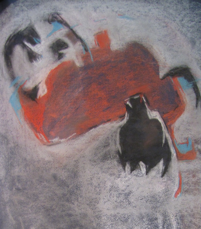
Your paintings are mainly abstract expressionism, do you start them like this (in abstract) while doing the sketches or do they get to this point at the end?
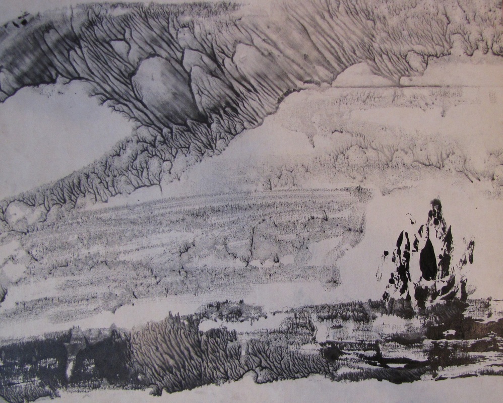
I start them as abstract, with pure form, and meanwhile while I am working on them, I might use stuff from nature and purposely make it a tree, or a body. I then crash them, and transform them again into abstraction. I am not pointing straight to, say, a chair. Rather, if the painting ends up to be a chair, it ends up there via an organic process of construction and destruction.
Also, the abstract paintings are rotated 90 degrees and repainted, and rotated again, and so on.
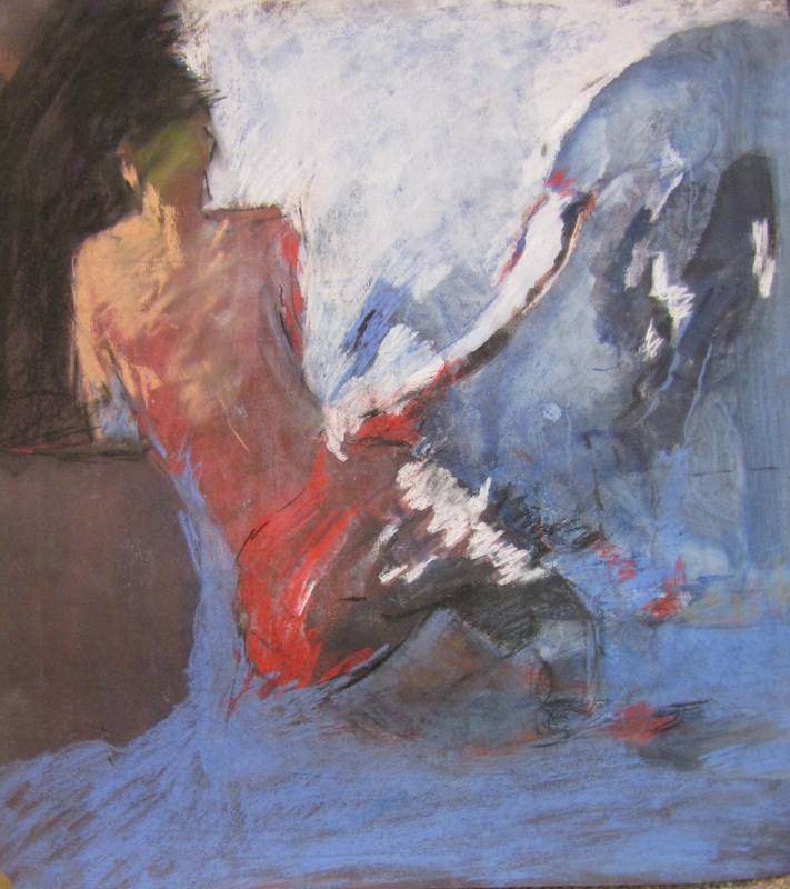
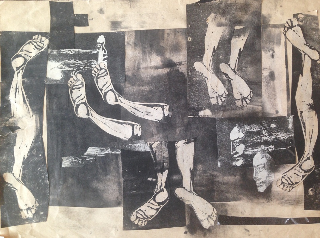
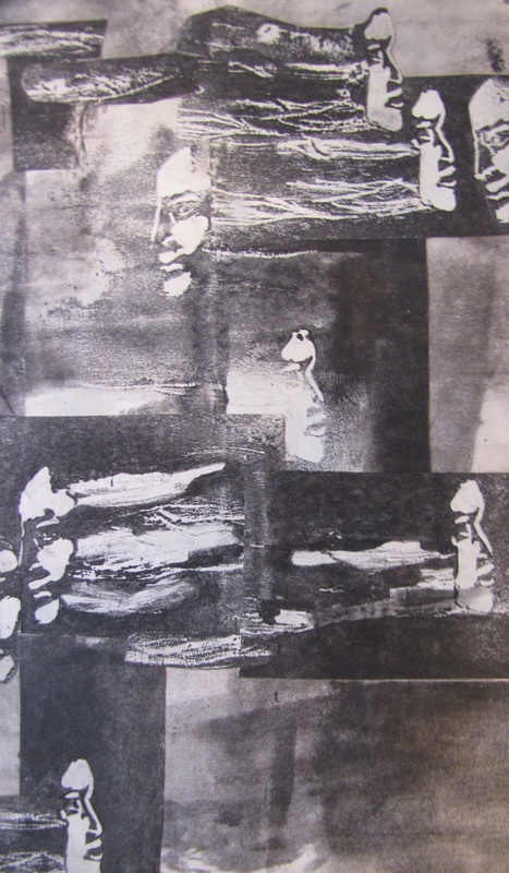
There is a unique and deep personal atmosphere in your work, and sort of by looking at them I got the feeling that the image is getting destroyed and maybe is destroying itself, but all of the sudden, in the middle or even in a corner I’ll find something that is taking shape and it holds and protects the whole image. Am I right? Can you explain about this?
Yes. That’s right. The thing about the forms, I don’t want to limit the viewer to some stupid circle or rectangle, so purposely I let them relate the forms to the world outside the canvas. I am not able to be limited. The painting’s forms keep changing. They keep crashing; coming back again. So hard to translate in English! This is a communication between me and the forms, and the audience or viewer. Take the viewer inside, and bring him out.
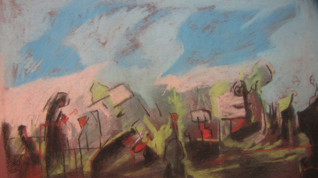
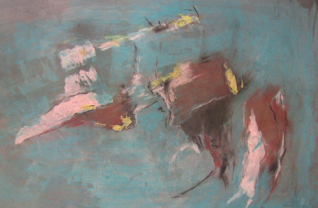
Are there any stories behind your paintings? Could you explain the story behind a few of them and tell us what’s happening?
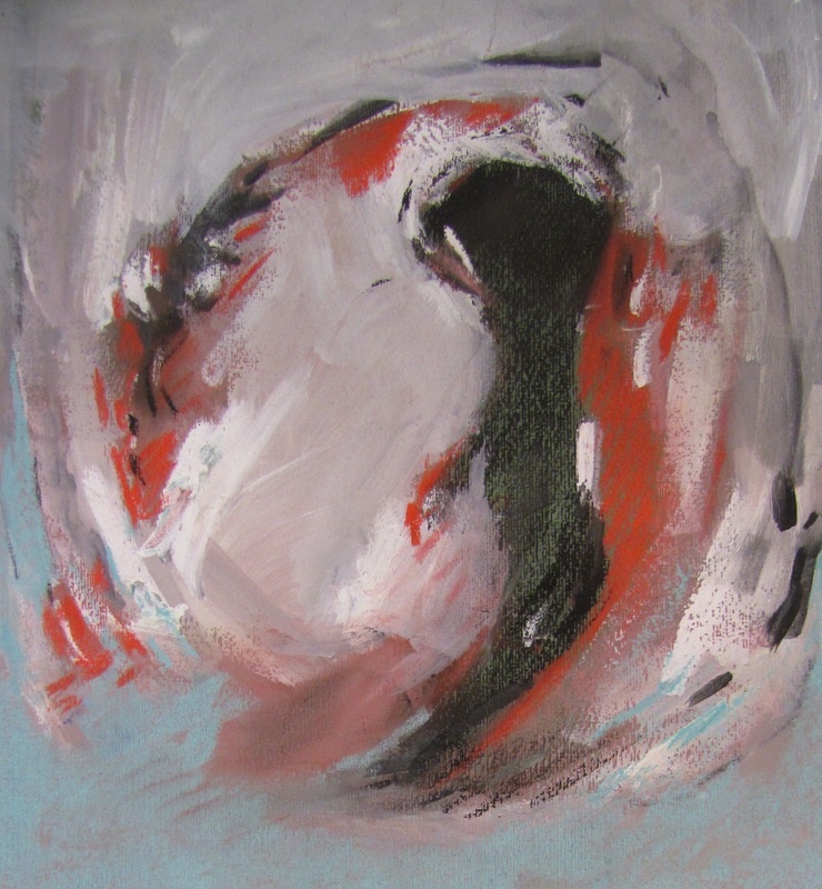
Rain: It started with pure abstract forms, and I noticed that some forms looked like rain on a window on a sad rainy day, and so I purposely changed the colors to be sad. They also looked like a bulb that is melting.

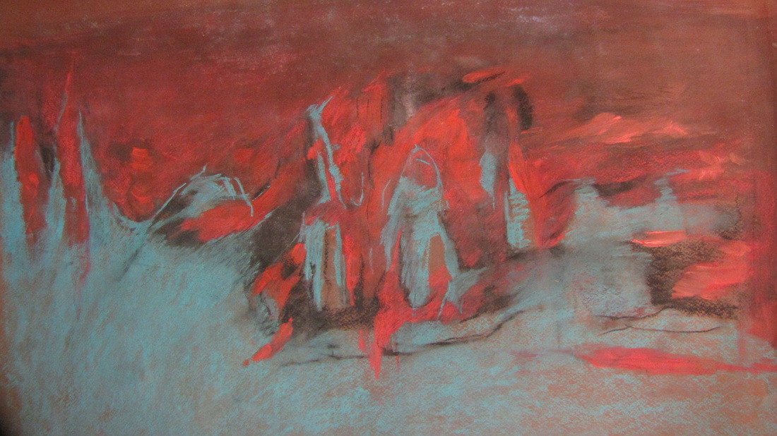
Untitled: It is purposely coming from nature, inspired by mountain and ocean, because the mountain came out from the ocean. The forms from the mountains are so sharp, and even though they’re often gray, their sharpness is represented by the color, and they have for many years been hidden under water, and have now emerged saying they are here.
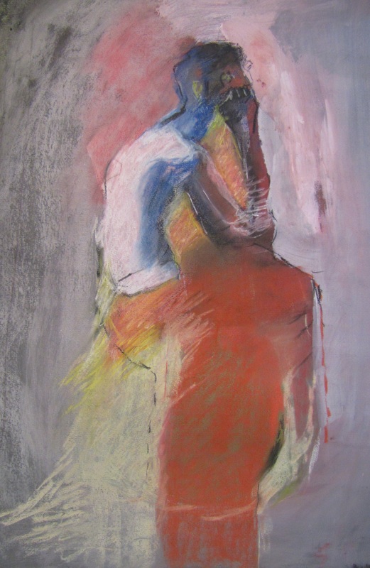
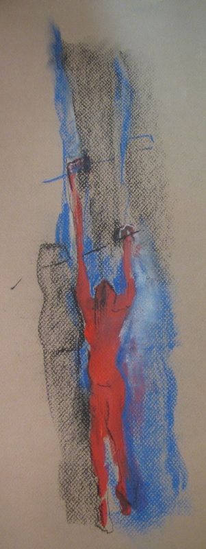
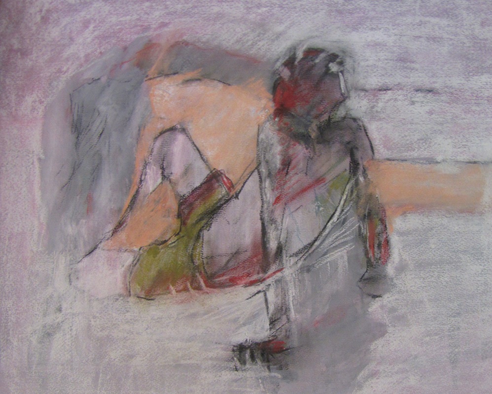
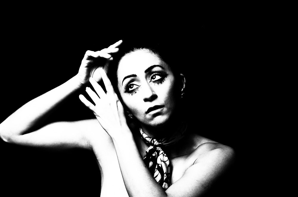
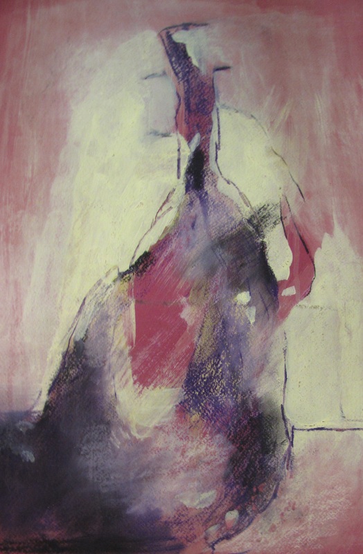
Portrait: This is a portrait from a model, and a poster for one of my exhibitions in Iran. Mostly when I am painting the people I am trying to show the emotion at that moment, whether in a studio or a coffee shop, and adding my own feelings, and exaggerating the emotion. The portrait in this case, he looks so proud, and from some corners falling apart, but is nevertheless so straight.
Vase: This is painted from a real vase. When I look at a real figure or still life I look at them as a different thing. For still life I feel they still have a soul; they talk to you and have a story, the people that were with them, around them; then you can connect to them, see the colors, and let them go through your filter, and passes from your filter. With my filter in my eyes, I show it to people. People with normal eyes can’t see what I see. Even a normal vase that looks old or ugly, through an artist’s eyes it can look like a million dollars. That’s the job of artists, to show you the beauty, to show viewers what they can’t see, to change the world around them.
A small sketch, painted very quickly, maybe 10 minutes. A view to downtown on a cold winter day. I like to have a contrast between the two or three colors, capturing attention of the viewer.
Now talking about the colours; the viewer will deeply get involved with the colours in a way that I was cogitating about my own issues and problems while looking at your paintings, do you start every painting like this? I mean are you struggling with something in your head? Is that your intention to involve the viewer like this?
The colors come from my palette, sometimes I narrow myself to cold, or warm, colors; and sometimes all are there, but I only use three or four. I let my emotion take me to my color choices, especially pastel paintings. If you uncover, or x-ray, my paintings you will be surprised to find layer after layer of things covered over. For example, I try to keep a tone in my paintings, and a contrast, especially between dark and light, so usually the colors come emotionally, unless in some other painting I decide that the piece should only be with two or three colors, and I choose the frame and choose the colors, say red and white, and I imagine the color, and if during the painting the concept is not good, I change. But usually my imagination is good, and I don’t have to change. I want to surprise people by the color, and tell another story with the color. Color is the main thing in our life that we pick in our clothes and other items and we express ourselves via color; it tells others about our personality. I don’t like dead colors. As much as you see the world colorful, you’re much happier. I want sharp colors, red, and green, blue, to show more life.
Is there a reason for using mainly pastels?
The pastels at the web site were those shown at one of my exhibitions. I do acrylic, pastel, oil, and everything. I enjoy mixed media, for example combining acrylic and pastel, and it can be soft, and hard, and you can use your fingers. Pastel I enjoy because it’s easy to get texture and emotion, and easy to mix with acrylic.
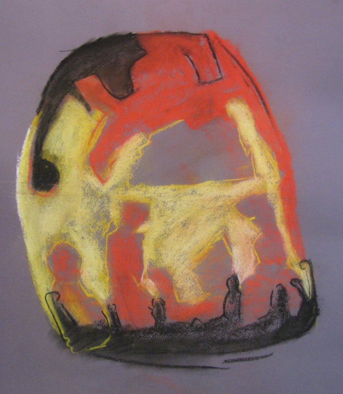
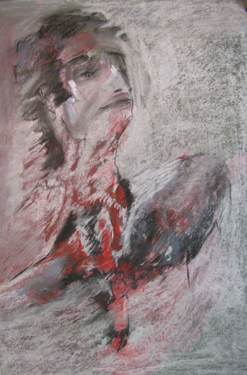
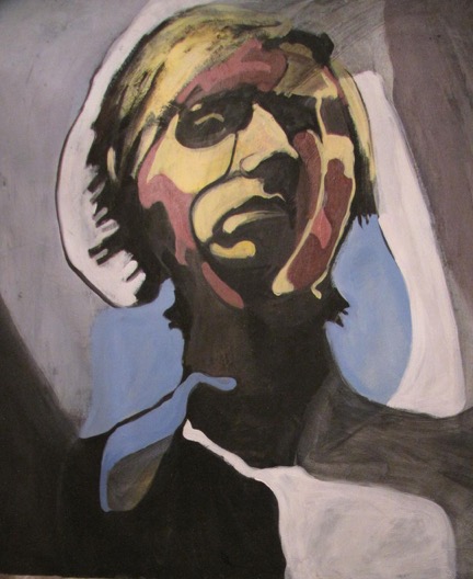
Is this a self-portrait? Personally, the way that you’ve used yellow, with all those shadows and shades and how you’re looking down at us, gives me the feeling that you are sad and mad about something.
No, that’s not a self-portrait. That’s from someone else, a model. I was trying to show very sad, and purposely picked yellow, because yellow — *that* yellow — shows sadness. Trying to show his abstract forms. The muscles on his face that I see, I divided them into specific geometric shapes, and by that, and the colors that I pick, trying to show his emotion. I hope the viewer can contact with that emotion, and feel it.
Where do you get your inspirations?
My inspiration comes from many things, especially from the people I see, and guessing what they do, what is their character. Same for nature. If I see a place, I paint it, but make it my own. Some are from dreams; I wake and paint them. Some from my emotions, if I am sad and depressed, I start painting to make myself calm down.
Could you explain the concept behind your sculptures?
The concepts behind my sculpture begin from a thousand two-dimensional sketches. Then pick 100 from the thousand, and then 20, and then 5, and finally a three dimensional shape is selected. You have a lot of things in your brain, leading to the thousand sketches, but most are not good. Coming from things you saw, things you feel. But from these one must select just the right few. Pick the five, and then starting to build a small model. After the model I decide which material I should pick. I am mostly trying to build something that is like a new myth. Old Greek myths — Gods and creatures — but it’s time to introduce to people *new* myths, and tell their story.
How do you choose your materials?
Usually when I cast, I cast bronze and aluminium, and then I decide if the statue is better in bronze or aluminium. Or, before casting I might decide it has to be, say, just in wood. The subject talks to you while you are building the model, and tells you what material is the right one.
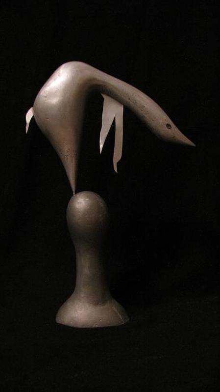
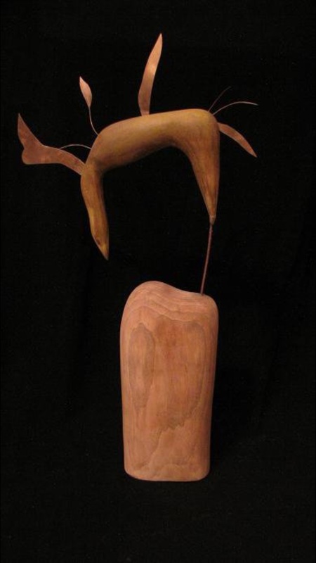
Why you’ve mixed metal with wood for those two birds? Is there any special reason for this?
As you see in my paintings, I don’t limit myself. I don’t do old-fashioned watercolor, or old-fashioned acrylic. I try to bring things together and mix them, and have a new structure. The texture between the metal and wood — and you even see it in modern interior design — it gives the feeling of pure nature, and human, because humans build the metal, yet wild from the wood.
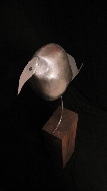
Whatever humans built throughout the centuries, the metal is rough. But wood is soft, and from nature. The contrast, like in my paintings, is between rough and soft, and there is a philosophy behind them — their combination is conflict: beauty in conflict. You see the total opposites, in both my paintings and sculpture.
This one reminds me of Auguste Rodin’s “Balzac”, did he inspire you?
I love Rodin, but there is a funny story. When I did this piece I wasn’t thinking about him, but perhaps I was unconsciously inspired. That was leftover plaster from a previous mold. I began to shape the plaster while it was still soft, and it happened in fifteen minutes, ending up with this figure, a woman looking up, standing on rocks. I finished the entire thing in an hour, after coloring and doing the patina.
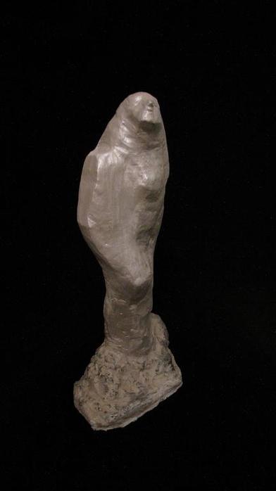
Photo Credit: Raheleh Baghri
Interviewed by Art Road